With the development of the age, progress in technology, continuous improvement of social productivity, people are pursuing more "convenient", "comfortable", "accessible", "safe" and "efficient" products to meet their physiological, psychological, intellectual and cultural demand when they enjoy material lives. Thus the designers are required to devise a product with both basic functions and "personalized designs".
"Personalized designs" in industrial design activities first refer to application of ergonomics.
Ergonomics is an interdiscipline involving multiple disciplines. The core of its research is coordination among human, machine and environment. Its methodology and evaluation means cover a number of fields such as psychology, physiology, medicine, anthropometry, aesthetics, design science and engineering technology. The research purpose is to guide the design and transformation of work equipment, work mode and work environment through application of knowledge from various disciplines, so as to improve product operations in such aspects as efficiency, safety, health and comfort level. Applying ergonomics in an artful and rational way is our SEEKRUN's way of design.
Evaluating competitors
This is a natural issue realized by our design team at an early stage. We raised such questions as "What are others doing?" "What do the competing products look like?" and "what problems do we have to solve?" Since the customers have to make a choice between our products and others' substitute products, we need to analyze customer experience that our competitors may provide - which is very important for us. While reviewing direct and indirect competitions, we need to make a logical analysis, collect the pain points as well as merits of the competing products and finally infer both a focus model of users' experience and a complete product definition.
Let's take X1 and G1 as an example. At the initial project stage, we made investigations and experienced in person many similar products in the market. We found the mid-mounted display instrument modules had such pain points as small screens, low resolution ratio, inconvenient angle adjustment and a dynamic reading difficulties. The reason behind is that horizontally our static vision covers an area with 60 degrees to the left and 60 degrees to the right, where our viewing angle to discriminate characters is 10°-20°, our viewing angle to discriminate letters is 5°-30°. Therefore the characters and letters tend to diminish from our eyes within their respective scopes. Our viewing angle to identify color is 30°-60° and human eyesight is the keenest within 1° of the standard sightline each time. Vertically, assuming the standard sightline is level, which is of 0°, the maximum viewing area goes from 50° above the standard sightline and 70° below it. Color discrimination boundaries are 30° above the standard sightline and 40° below it. But actually, human's natural sightline is lower than the standard line, i.e. 10° lower in the standing position and 15° lower in the sitting position. However, during riding simulation while watching the displays we found that our best view area was 30° lower than the standard sightline. In addition, our dynamic visual acuity in riding is hard to compare with that in static status. These lead to a super high requirement of the display quality for E-Bike display instruments. (Data cited from Ergonomics by Gao Fenglin)
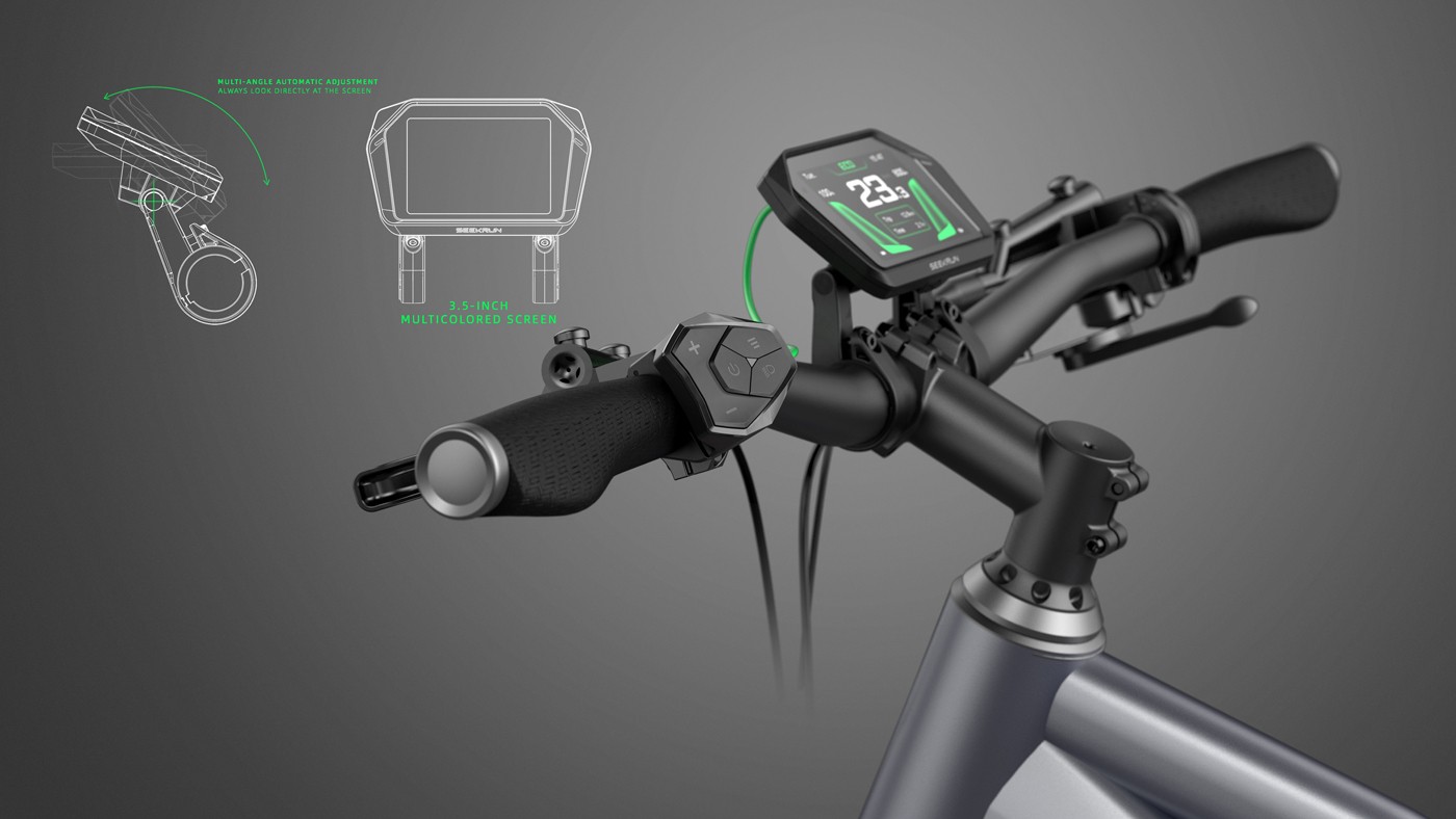
In the end, we chose to introduce the 3.5-inch TFT large color screen with the resolution up to 480*320dpi and a viewing angle of 178° as one of the hardware development foundations to ensure the meter within the optimum range of vision. The reason was that the bigger the screen size, the higher the resolution ratio and the bigger the visual angle was, the more convenient it would be to view the displayed information. In the subsequent process of design, we gradually defined the necessary requirements such as angle adjustable display instrument support, full-fit technology for display panels, graphical UI interface, etc. These HMI-related measures enhanced the readability of the displayed instrument content.

Testing with users
Everyone finds it simple to say confidently that he/she knows the product better than users and that "the users do not know they need it before using it". This, however, is true in rare cases. Don't forget that all our designs are for the users.
Guided with the past experience in design, our team voluntarily proposed the idea of "testing with the users" while designing A1. So what is "testing with the users"? That is to take a bold action in "introducing" our internal designing schemes to others – by inviting our non-specialized staff to real riding activities to experience a series of samples and schemes and to collect their truest and most objective feeling on HMI (human-machine interaction). In this way we got a more objective investigation result, based on which our design team created A1 display instrument with superb product experience.

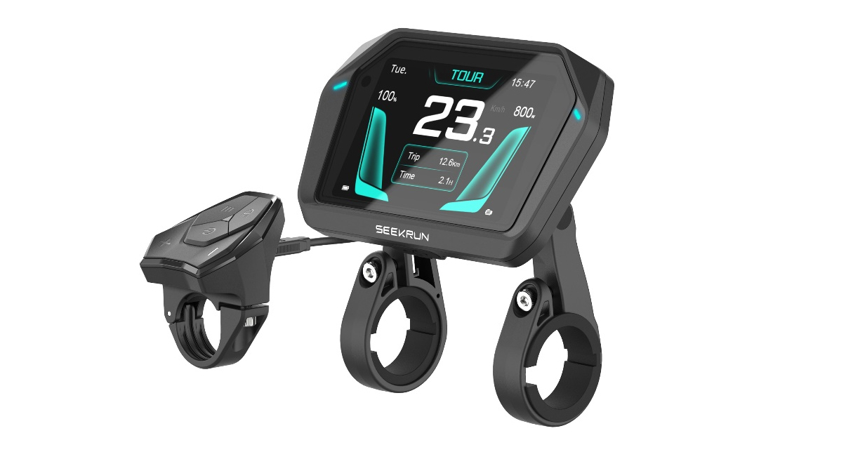
Almost all people other than the design team marvel at the individual and differential appearance when they first see our A1 panel– angular style of surface and body, changeable visual perception, "heart-echoing" breathing lights…What is the more commended, however, is the comfortable and high efficient HMI (human-machine interaction) by people who have experienced A1. We owe all this to our ultimate requirement of Ergonomics for the product.
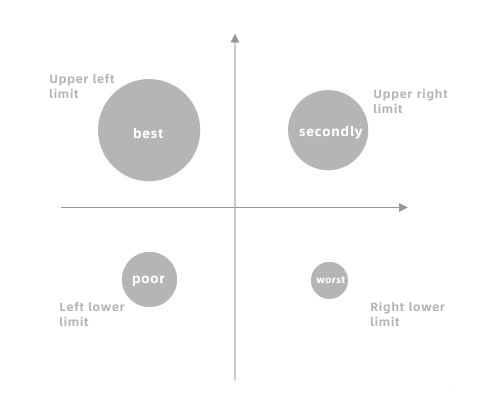
The following graph shows the situation when our eyes deviate from the visual center and the off-side distances are the same from the center. The ordering of viewing areas in viewing effect is left upper > right upper > left lower > right lower.

· The eyes move faster and are uneasy to feel tired horizontally than vertically. Usually, objects in the horizontal direction are seen before those in the vertical direction. Therefore, many display instruments are designed into a transverse rectangle.
· The misreading rate of a horizontal display instrument (28%) is lower than that of a vertical display instrument (35%). (extracted from Ergonomics – Visual Features)

During the whole process, we completed the design scheme for the meter first. This time, guided by ergonomics, we chose to place the 3.5-inch screen in the horizontal direction, since the eyes moved faster and were uneasy to feel tired horizontally than vertically. In this way, users can take a quick look of the instrument display and minimize the neck movement, which will effectively reduce the potential safety hazard users may have while viewing the display instrument.
However, while we were more satisfied with our display instrument design scheme, we felt more disappointed with the original matching remote. In the end, we were determined to start all over again: we would never let it be when HMI remote modules were most needed!

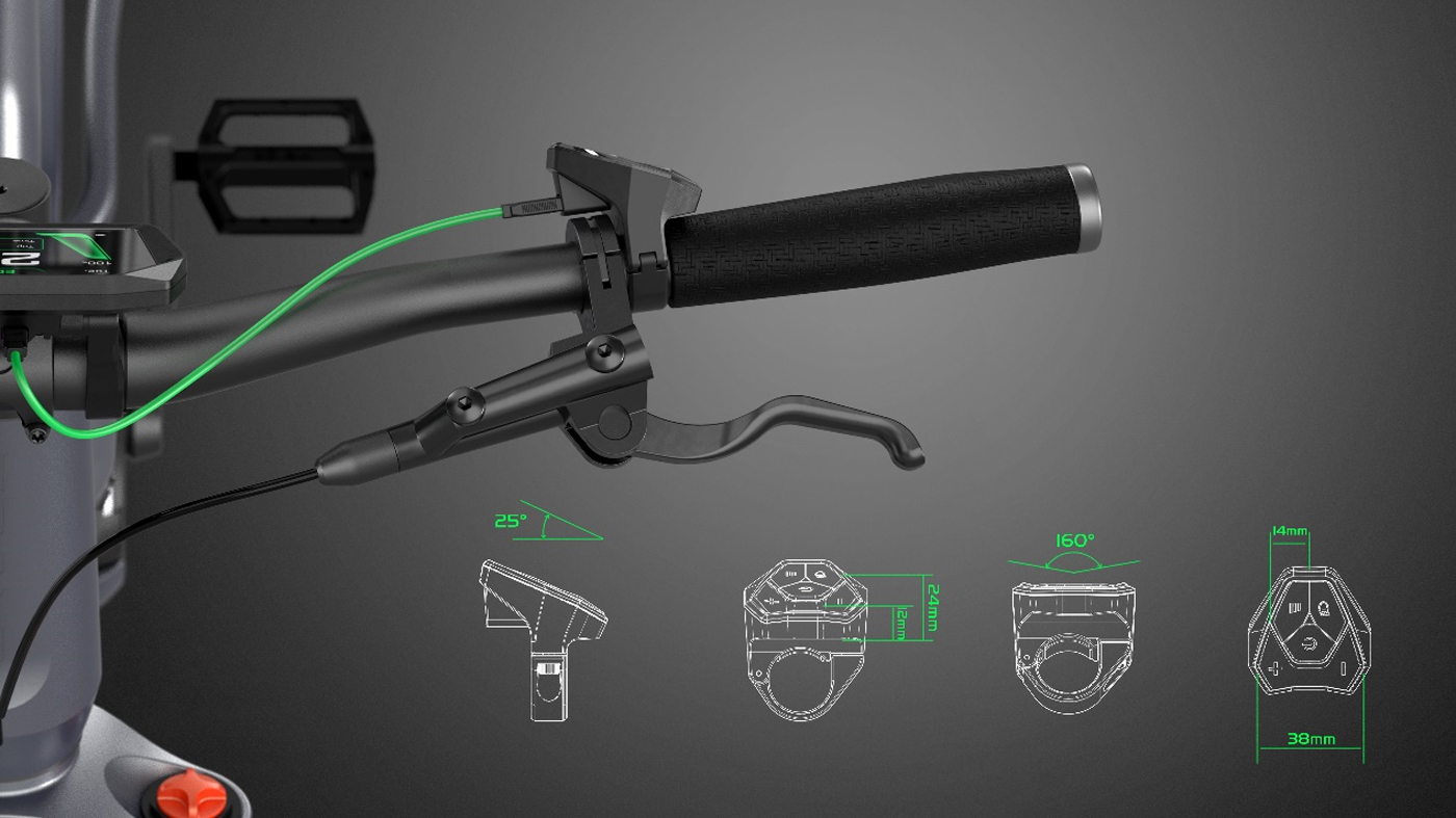
After repeated deliberation by the expert panel, we finally decided to set the operation interface 25° upward to the left, the common '+/-' button at an internal angle of 160° and the height difference between the remote and the handlebar grip within 12-24mm. In this way we basically achieved a clear priority of the remote layout and ensured that the user's thumb could fit the remote at any moment of riding so as to enjoy the most efficient and comfortable operation and control. The ability to control with one finger is significant for cycling – since similar one-handed control is always a hot topic in smartphones.
There being always room for improvement
With the growing strength of the team and the gradual increase of customer recognition, our project roadmap keeps broadening at an accelerated pace.
Our design team has recognized from the beginning that SEEKRUN's design focus is on human-computer interaction and ergonomics, and that appearance is only a surface response to all solutions. Our improving technology and cognition users' evolving aspirations will drive our products to constantly update and iterate and our design activities to advance. All we have to do is to follow the ergonomic theory in our continued pursuit of the ultimate human-computer interaction experience for new products.
SEEKRUN focuses on the enjoyment of sports, caring safety, and supporting the growth of partners. Currently, in the Ebike industry, SEEKRUN has developed a complete product matrix of intelligent hardware, including displays.
Copyright © SEEKRUN All Rights Reserved Sitemap